FERNISH
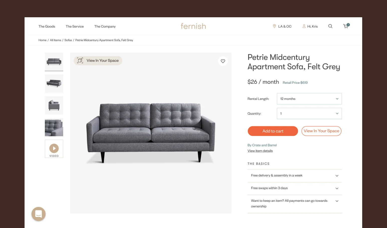
How might we draw more attention to the new augmented reality enabled “View In Your Space” feature on Fernish’s web store?
Fernish, a furniture rental company, had recently added a sort of try-before-you-buy feature that allows prospective buyers view using AR how an item would look in their home before purchasing. Though the adoption rate was incredibly low with the feature being used only about 8% of the time.
*Important to note that at the time screen recordings and particular statistics were not available to us
.webp)
Hide and Seek
I began with an analysis of their website and in particular their item detail page and explored what interactions existed and where there was room for further exploration.
The first thing I noticed was that without scrolling on the item detail page there was no indication of the existing “view in your space” button or feature.
.webp)
Why was this Important?
The main CTA on Fernish PDPs is “Add to Cart”, with secondary interactions via the Gallery and “Add to Wishlist” functions. These essential functions are all visible above the fold, the AR CTA button and dimensional image are located below it.
So it is then very possible for a user to move past this product or perform functions such as adding to wishlist or cart and never even be aware of this feature.
Another observation was below the fold, the buttons even when visible weren’t necessarily prominent or placed in very attractive positions.
.webp)
Prominent Positioning
For my first solution, I moved the “View in Your Space” button to be a secondary variant of the “Add to Cart” button which also places it in a more prominent position.
I also added a “view in your space” button on the item image which has a hover effect to both intrigue and educate the user on the AR functionality.
.webp)
.webp)
Did You Know?
For my second solution, I introduced a slightly simpler change that maintains the existing button placement but brings more attention to the AR feature. The design introduces a toast (on desktop, a modal on mobile) that appears approximately 10 seconds into a user session, prompting said user to try the AR placement feature. This change is meant to target a user that’s still “iffy” about buying the product.
.webp)
Never look through your own perspective alone.
I did enjoy working on this project under Epigraph for the clients. It showed me how marketing a product/feature/anything really is at times more important than the actual functionality of said feature or product.