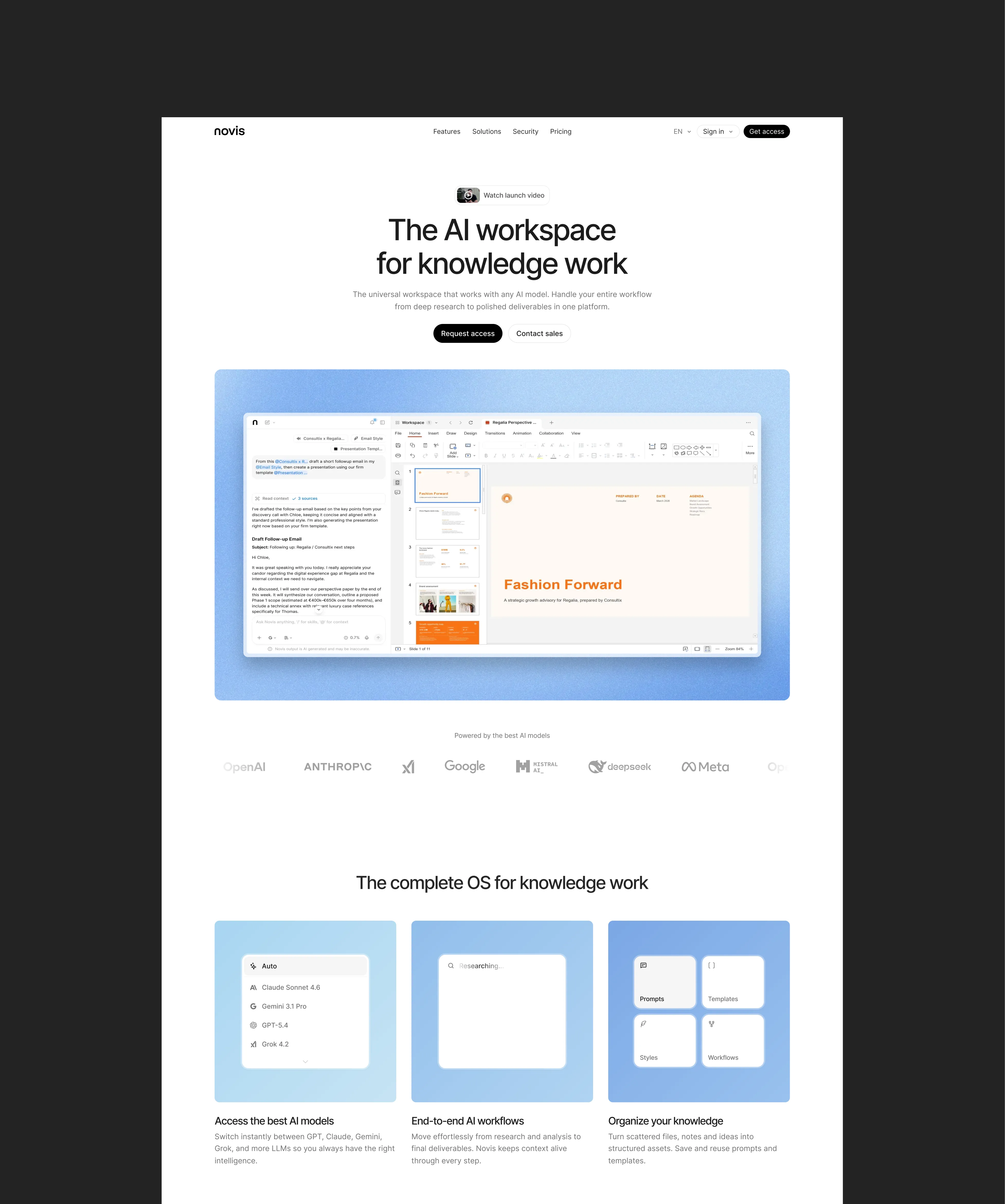

How might we turn a basic AI chat tool into a full workspace where knowledge workers go from research to finished deliverables without leaving?
Novis v1 was chat-with-files. You could talk to an AI, attach documents, preview them. That was it. V2 was the real vision: multi-model chat, native document editing (docx, pptx, xlsx), data extraction at scale, transcription. All in one place.
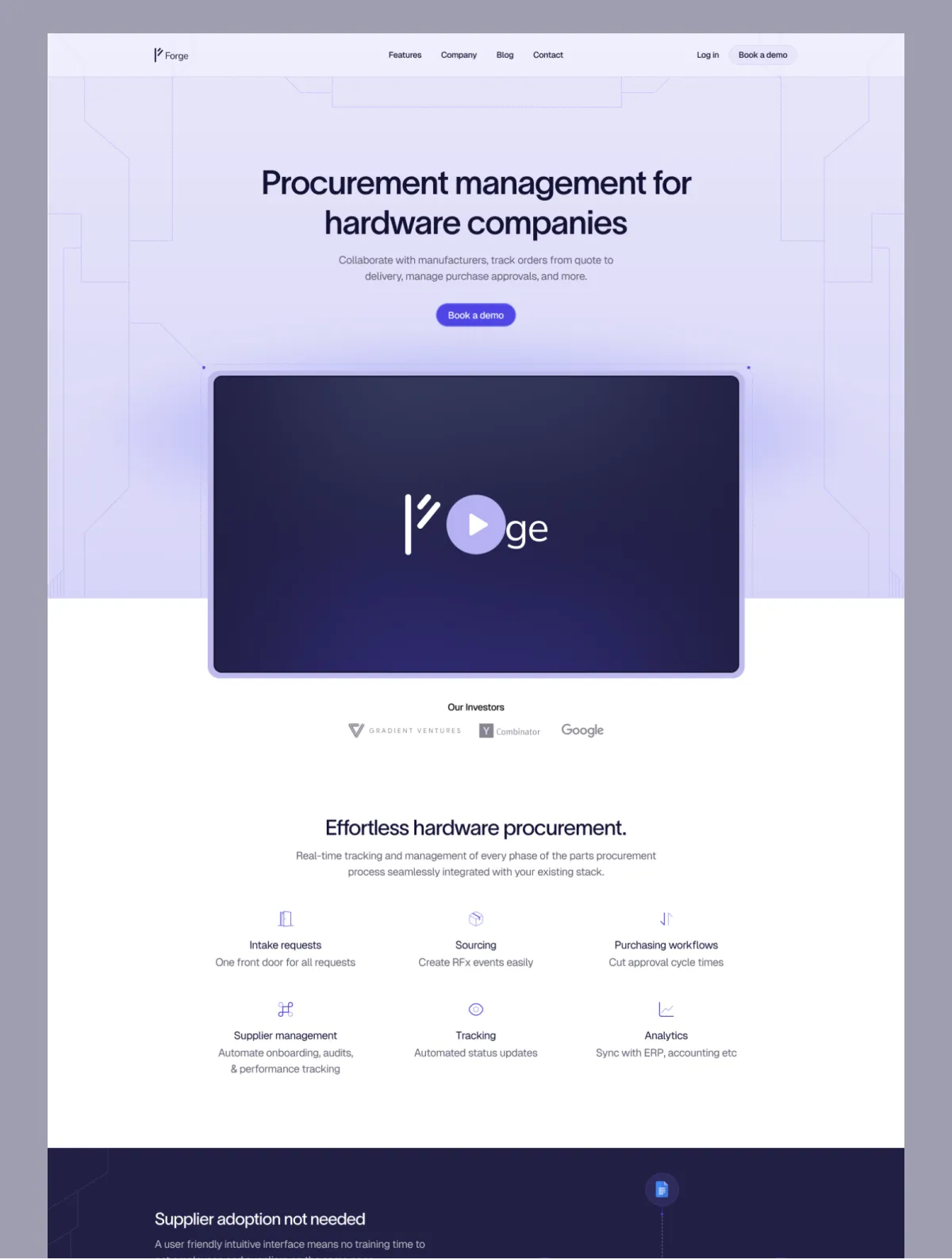
I came on as the sole design engineer. Owned the full product UI, design and frontend. Also worked on the website and launch video. Vincent, our founder, set the product direction. A freelance designer had worked on a bunch of v2 screens before me. I reworked parts, scrapped others, and designed several surfaces from scratch.
The Workspace
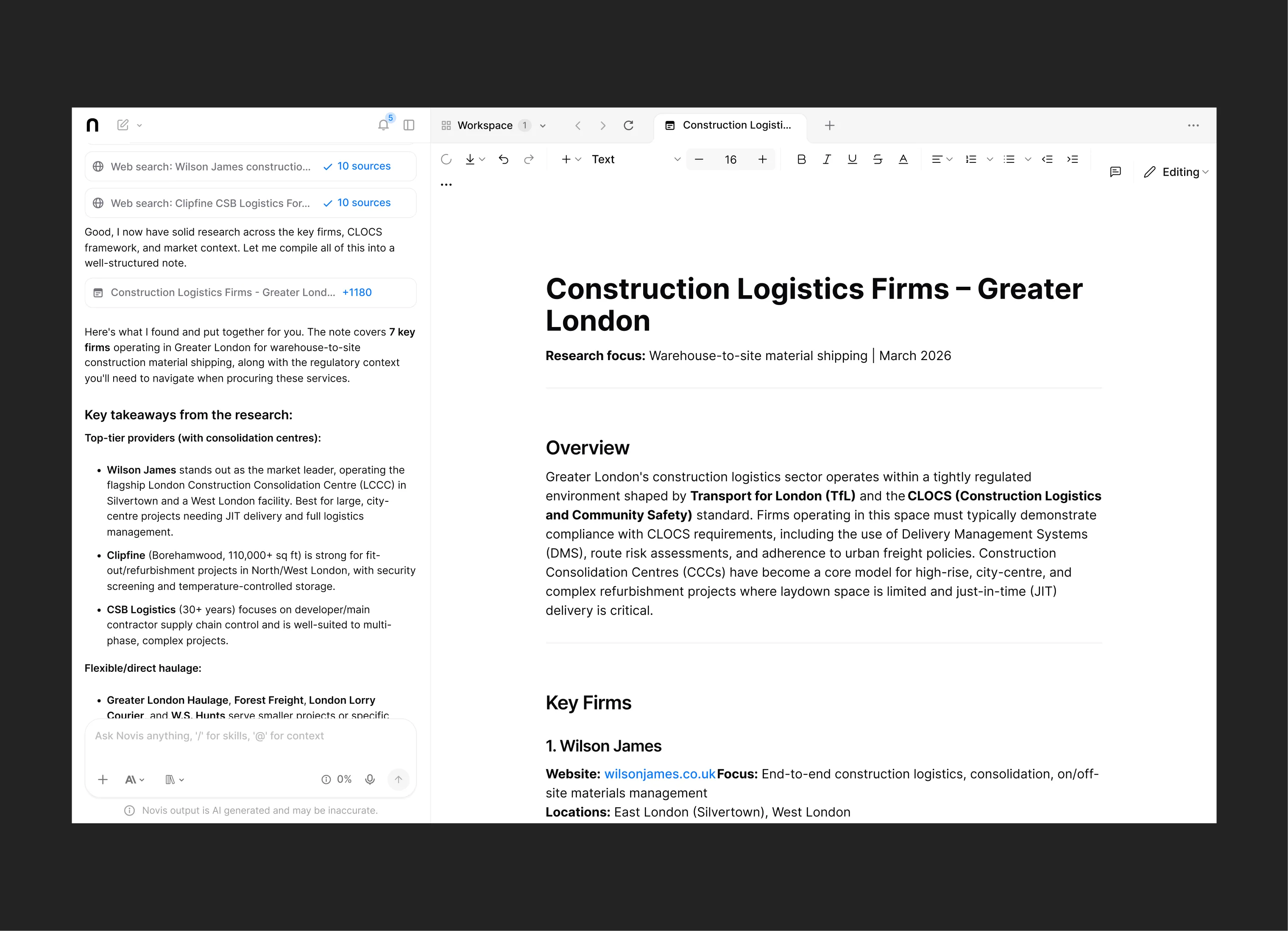
Split view. Chat on the left, workspace on the right. Open the workspace and the chat narrows, document takes focus. Drag to resize. Tabs along the top like a browser.
Had to feel smooth: the open animation, the drag performance, sortable and draggable tabs. And the workspace housed very different file types (docx via OnlyOffice, notes via PlateJS, PDFs, spreadsheets) all needing to feel like they belong in the same shell.
Highlight to Act
Select text in the workspace and a floating toolbar appears with quick AI actions. Rewrite, summarize, act on a passage without going back to the chat input. In chat, highlighting a response gives different options: ‘Add to Context’ or ‘Add to Workspace’.
V3 expanded the chat popup with copy options: plain text, copy for Gmail, copy for Outlook. Users were already moving AI responses into other tools, so we shortened that path.
Tool Calls
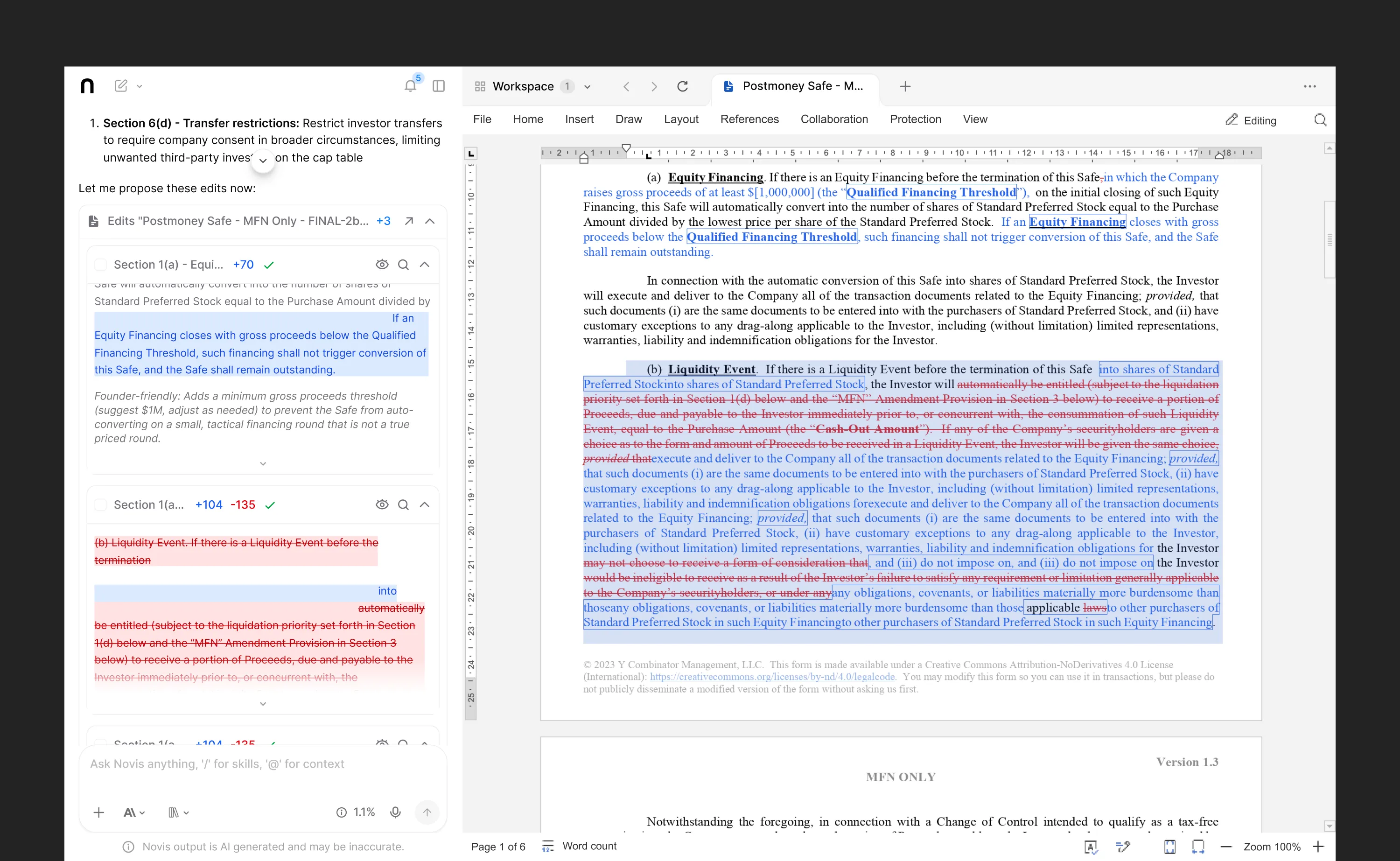
Most complex UI in the product. Full revamp landed in v3. When the AI made changes to a document, those changes showed up as tool calls in chat, batched. Sometimes ten or fifteen at a time.
Each batch sat in an accordion. Expand, collapse. Scrolling through multiple batches, the batch header sticks to the top of the viewport so you don’t lose track.
Individual changes had ‘Apply’ buttons. We didn’t auto-apply anything. Users needed to trust the AI wasn’t silently editing their documents. Preview in chat, apply to workspace. That was the trust pattern.
The apply buttons started with white backgrounds to stay visually quiet. Users told us it wasn’t obvious they had to click apply. So we flipped them to dark backgrounds to be more obvious.
With the workspace open, the chat panel was already narrow. Stacking batches of change previews got dense fast. Accordions, sticky headers, and ‘Apply All’ for confident users kept it manageable.
@ and / Commands
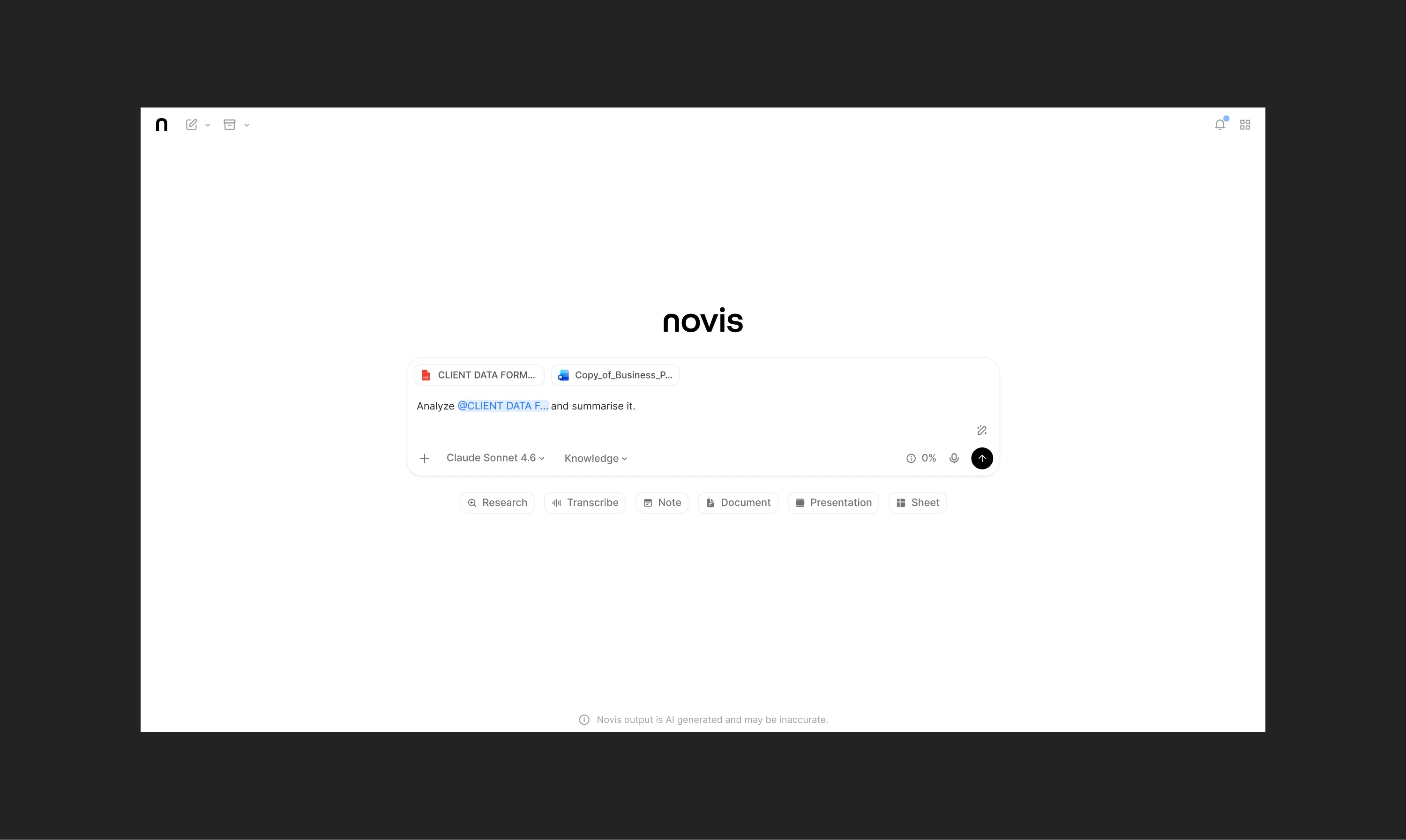
@ opened a popover to tag files, documents, or links as
context. / pulled up quick prompts and actions. Borrowed
from Notion and Slack: familiar, fast, keyboard-friendly.
Unforunately, I don't have screenshots of the @ and /
commands in action.
Transcription
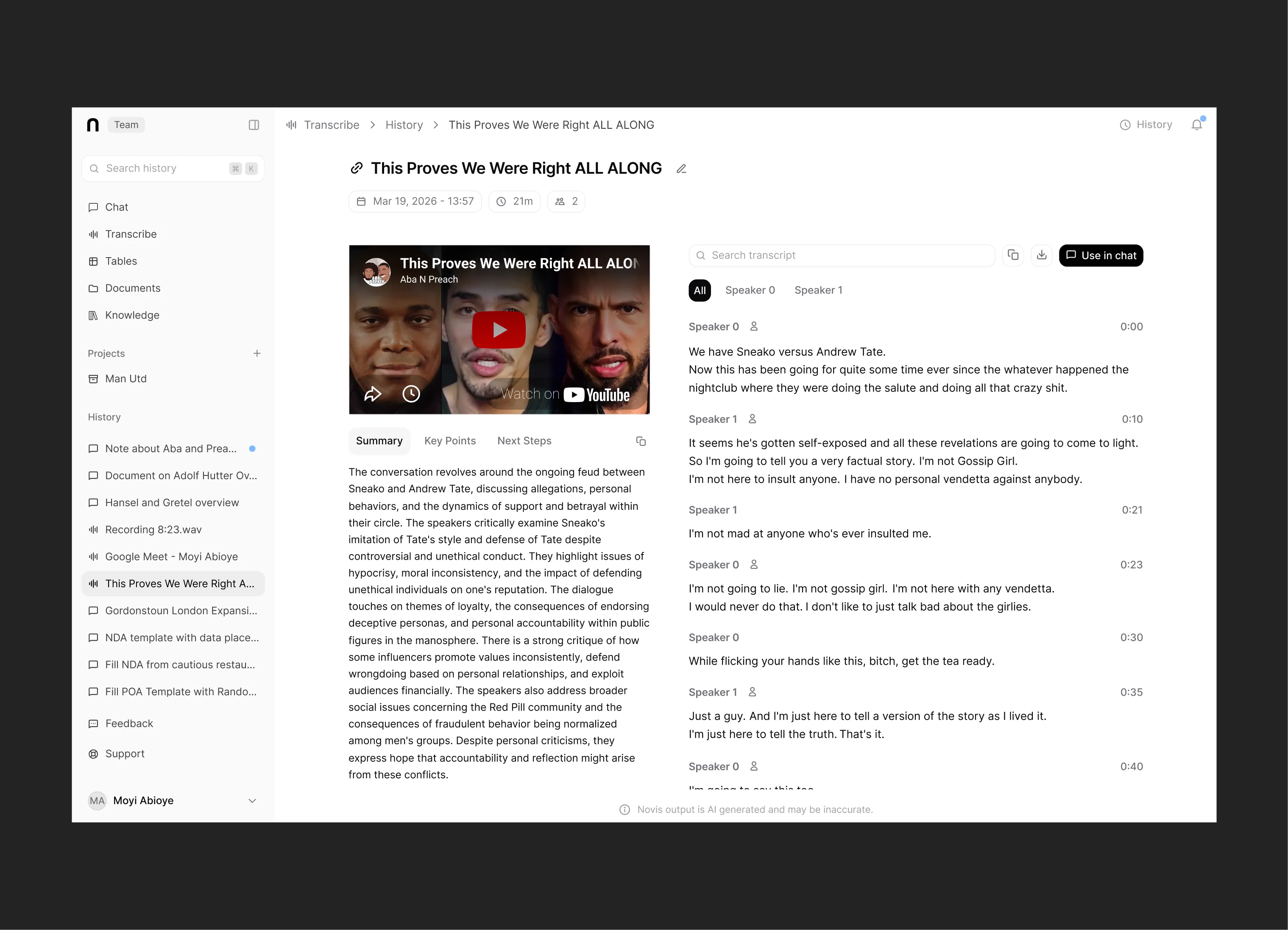
Didn’t exist in v1. Designed and built from scratch: the transcript viewer, different transcription types (meetings, uploaded audio, live recording), and the sidebar transcript view.
Add Context
The modal for attaching files, links, transcripts, and templates to a conversation. Went through several iterations because it had to handle a lot: file upload (drag-and-drop, Google Drive, SharePoint), document browsing with permissions, links, transcripts, templates. Plus upload progress, selection counts, and a live context percentage.
Main layout question was tabs vs sidebar navigation. Tabs worked with multiple content types. Upload states evolved too: inline progress early on, then status labels (uploading, completed, failed with retry) alongside the file list.
Backend limitations constrained some of this. Even the shipped version could be smoother. But the iterations show the problem well: one modal as the entry point for every type of context, constantly expanding.
Small Things That Mattered
We were chasing PMF, so speed came first. But when there was breathing room, I’d come back to a running list of delight points:
- Branded logo animation replacing the generic spinner for AI ‘thinking’ states
- Scroll area gradients on overflow content
- Animated sidebar icons
- Clip-path based tab switch animations
- Inline feedback over toasts everywhere: copy button flashes a check for two seconds instead of throwing a notification. Keeps the interface calm.
Decisions Along the Way
Link paste revert. Pasting a link auto-added it to the context bar. We watched users get confused. Many pasted links as throwaway references and seeing them explicitly added threw them off. Reverted.
Feedback widget. Started as a floating button at the bottom-right. Draggable, but still blocked important UI sometimes. Moved the trigger to the sidebar, opened as a modal instead.
Upload flow. Three clicks to upload: hit +, modal opens, click file selector. We added the option to press @ and hit enter when the file picker appeared. Much faster.
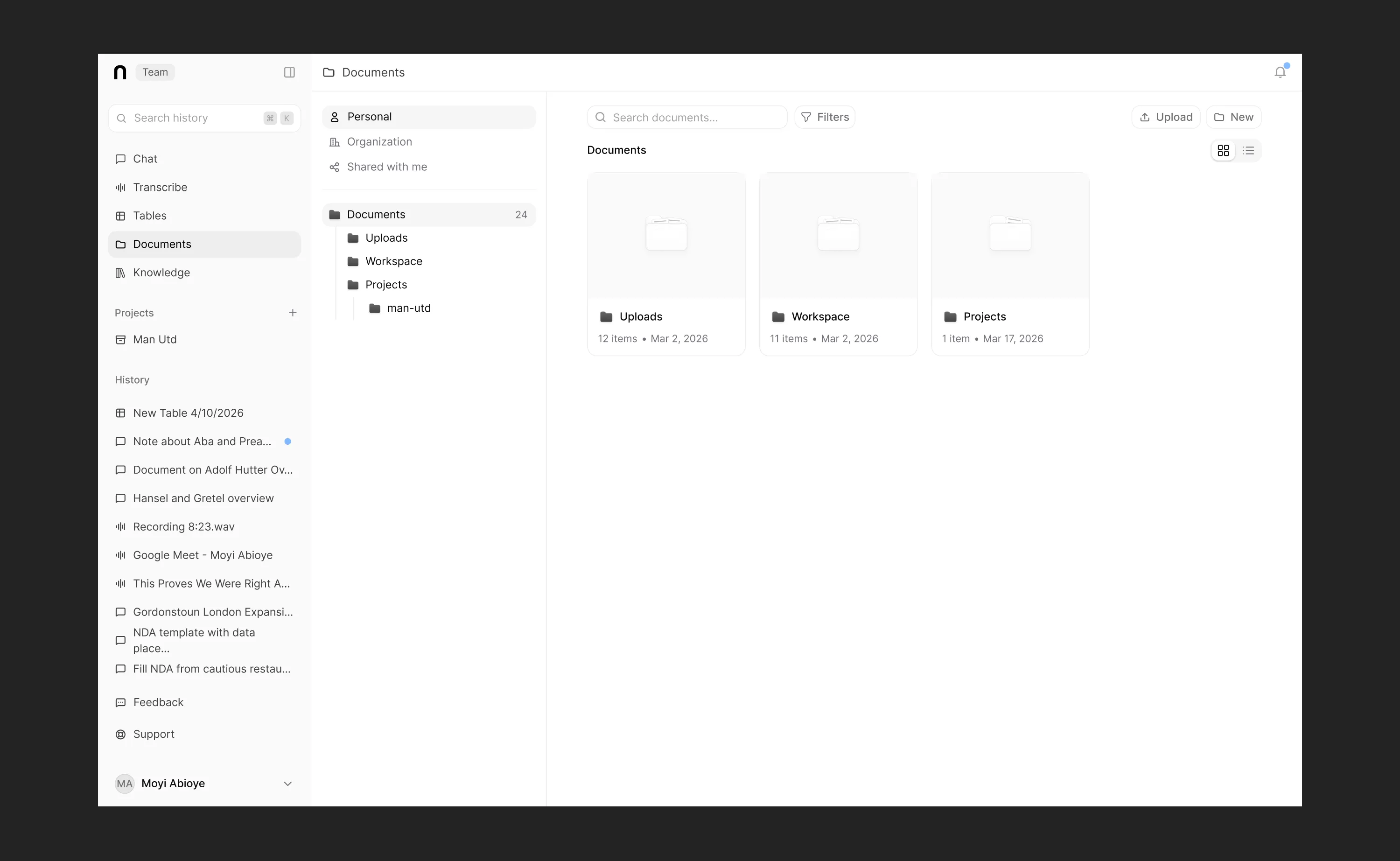
Global header. Only the chat page had a header. For consistency, we added a shared header across every page with context-specific options. Made the whole product feel more cohesive.
V3: Visual Softening
After v2 we did a visual pass inspired by Codex. Softer corners, lighter shadows, more subtle overlays. The monochromatic palette with blue accents stayed (core Novis brand), but everything got gentler. Dense, complex tool that still feels approachable.
Pick your battles. Keep the product calm.
Building at Novis was a constant balance between speed and craft. Small team, chasing PMF, most days the answer was ‘ship it.’ But I kept a list of polish items for when we had room, and tried to bake quality into the defaults. Inline feedback over toasts costs nothing extra but makes the product feel more considered.
An investor on a call with Vincent was surprised by the UI quality given team size. Good sign the balance was landing.
Biggest takeaway: when you’re the only designer and frontend engineer, you pick your battles. Not everything gets the ideal solution. But if the interaction patterns are solid and the product feels calm to use, the rest can iterate.